
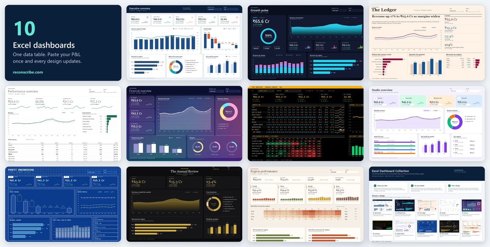
This Excel financial dashboard template gives you ten finished dashboards that all run on one data table. Paste your P&L rows once and every design updates: KPI cards, budget variance, a profit bridge, regional performance and monthly trends. Every chart, number and colour is live Excel, so you can change anything.
Pick the design that fits your audience, from a boardroom summary to a trading-screen P&L grid, and use the Year and Region dropdowns at the top of each one. This Excel financial dashboard template is free to download with a ReconScribe account.
10 Excel financial dashboard templates in one workbook
Each design below is a separate sheet in the same file. They share the Data and Settings sheets, so they always agree with each other, and every Excel financial dashboard template in the set works with the same six columns. Select a preview to open it full size.
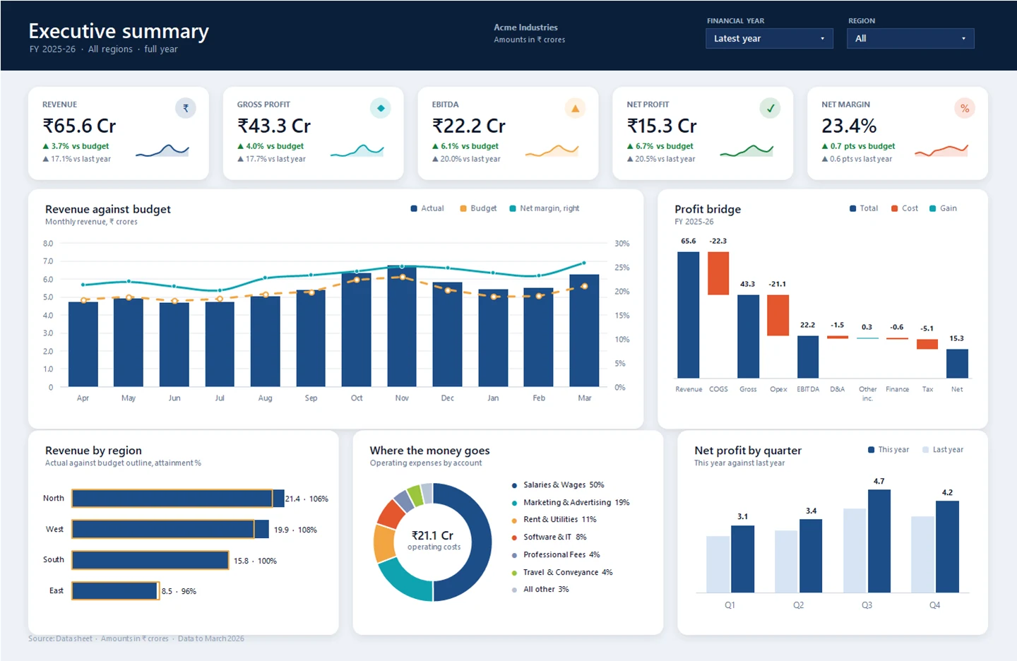
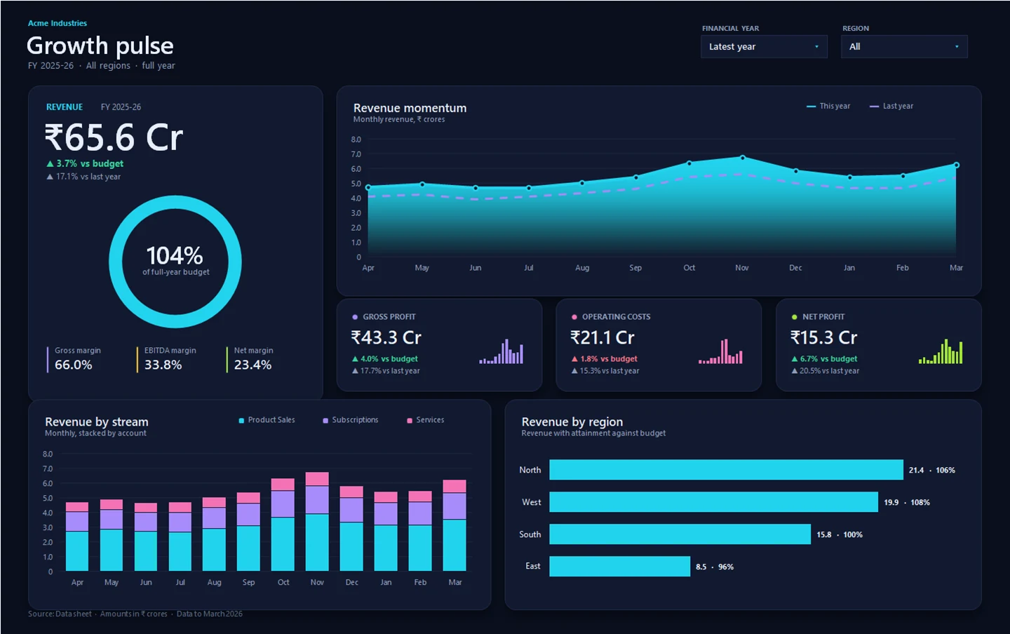
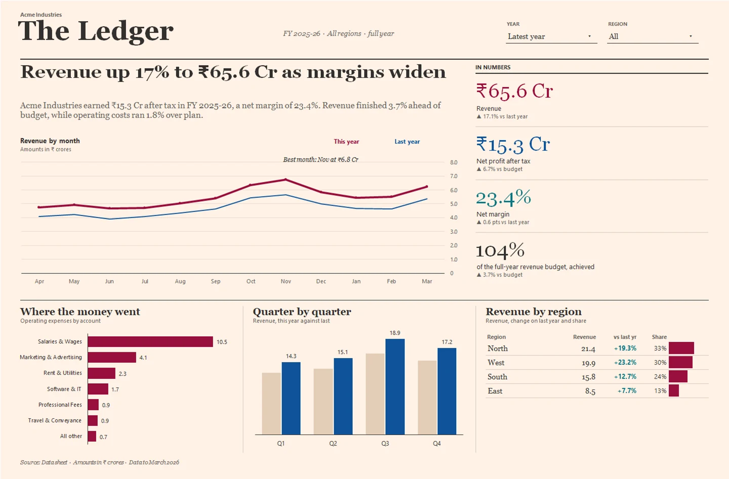
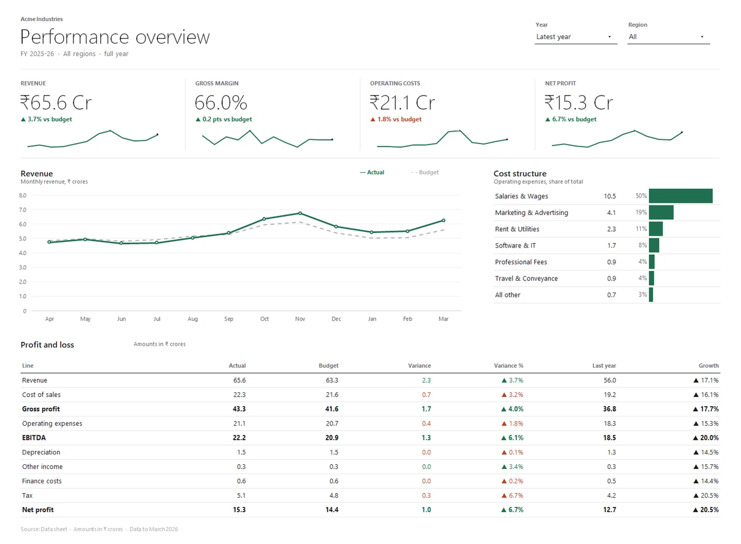
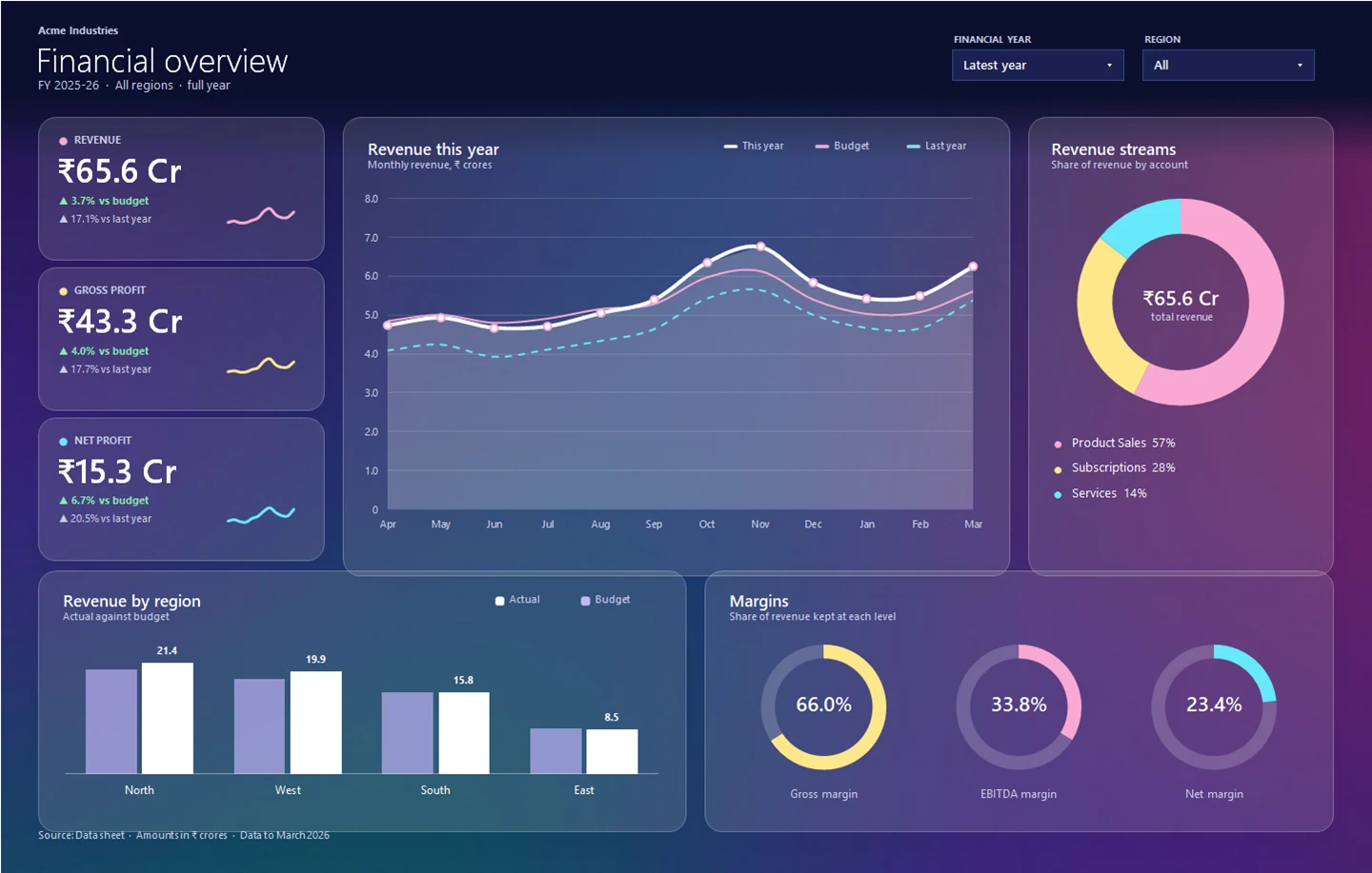
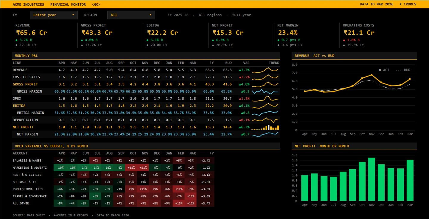
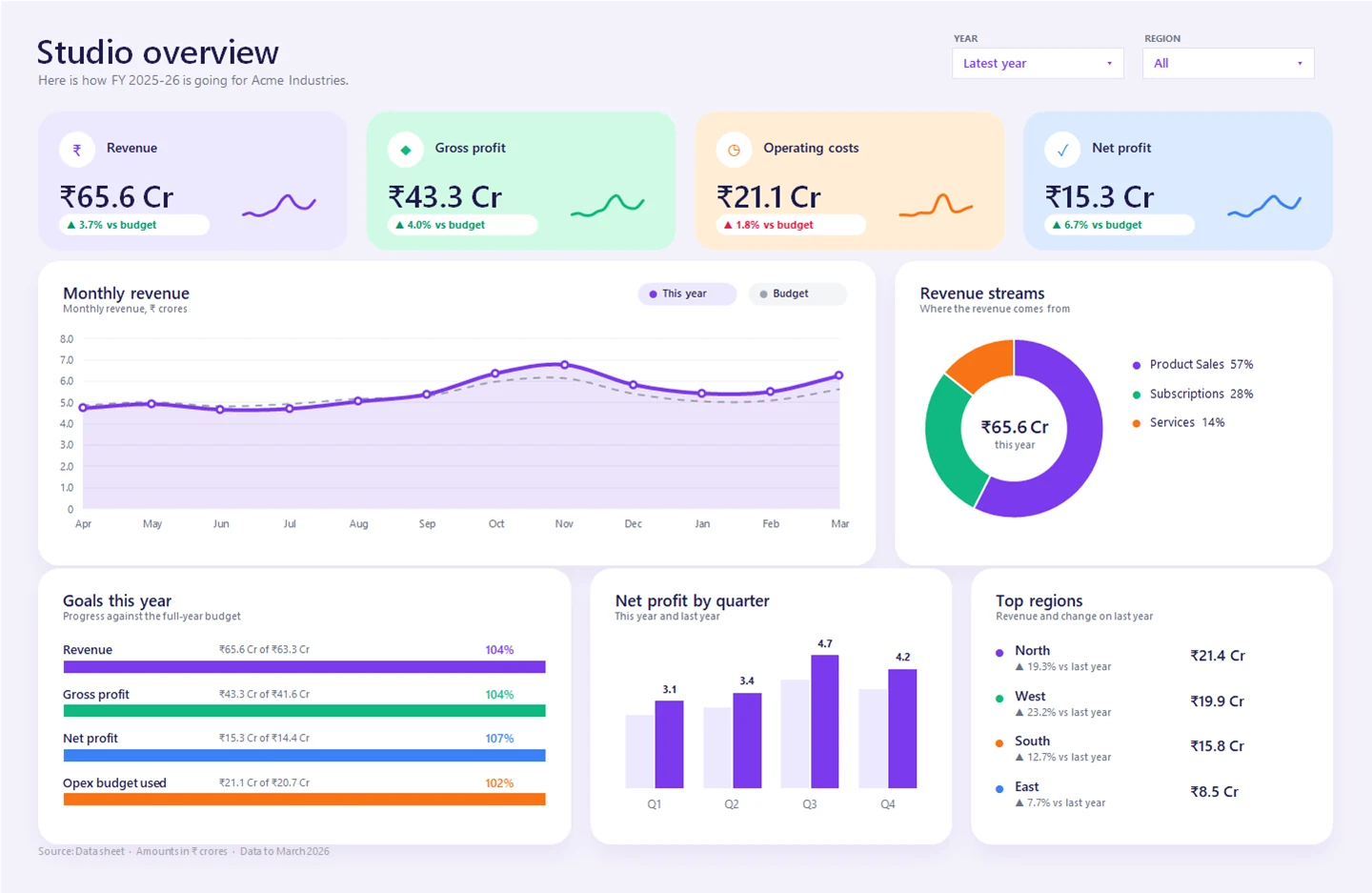
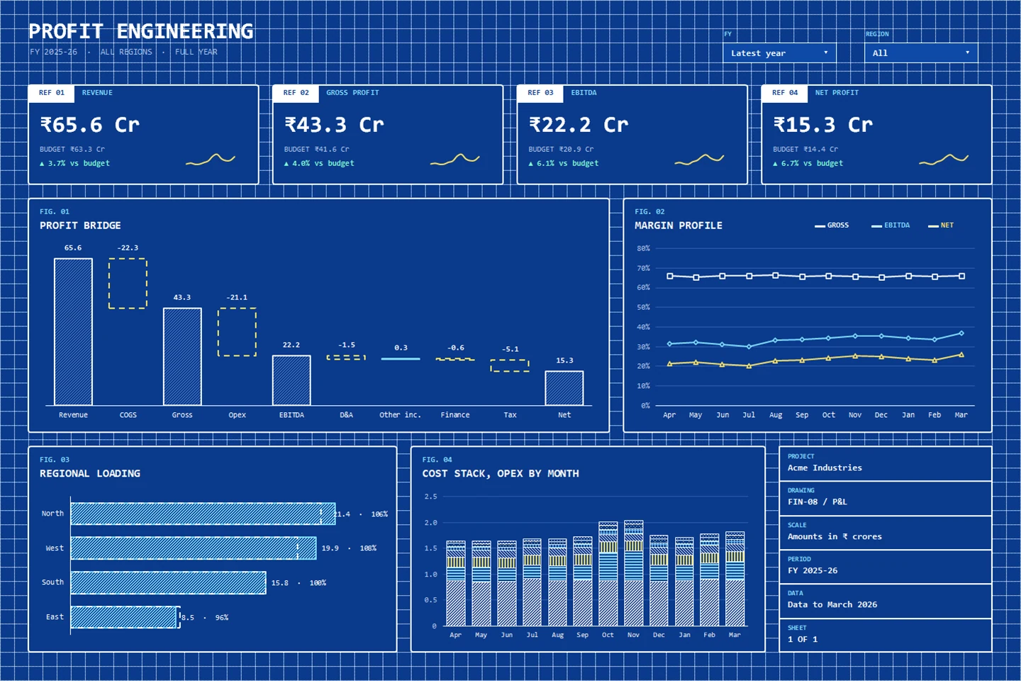
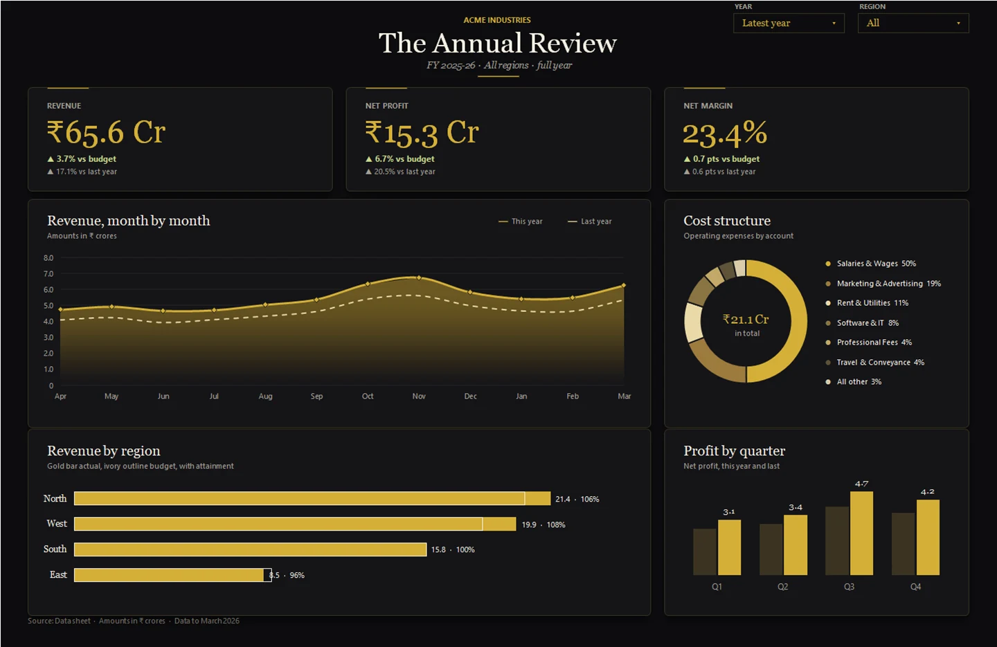
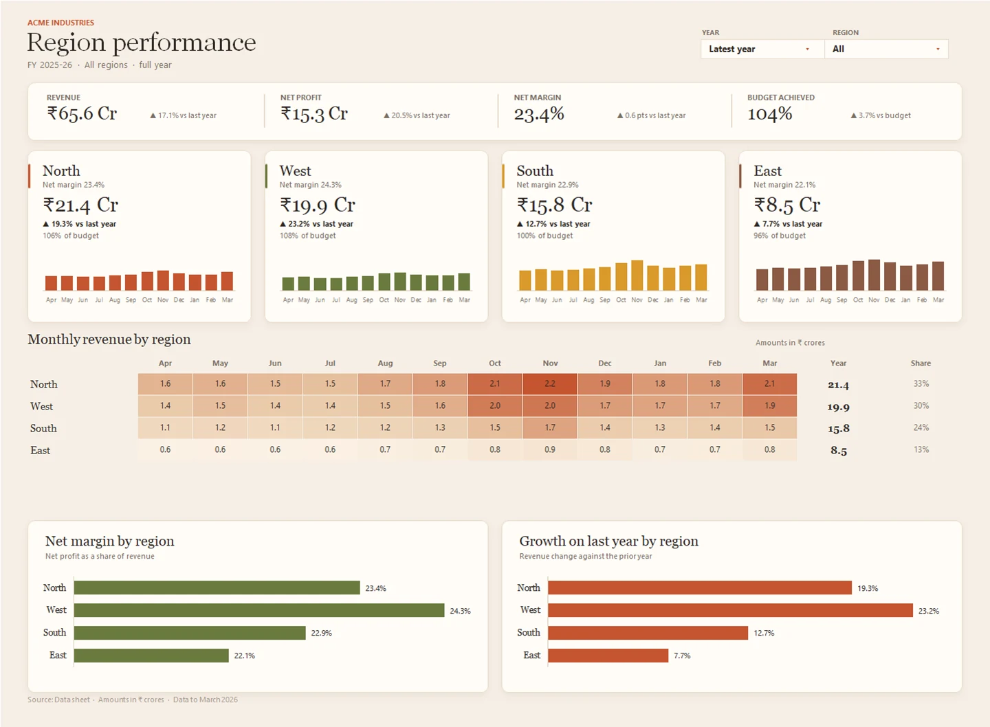
What is inside the Excel financial dashboard template?
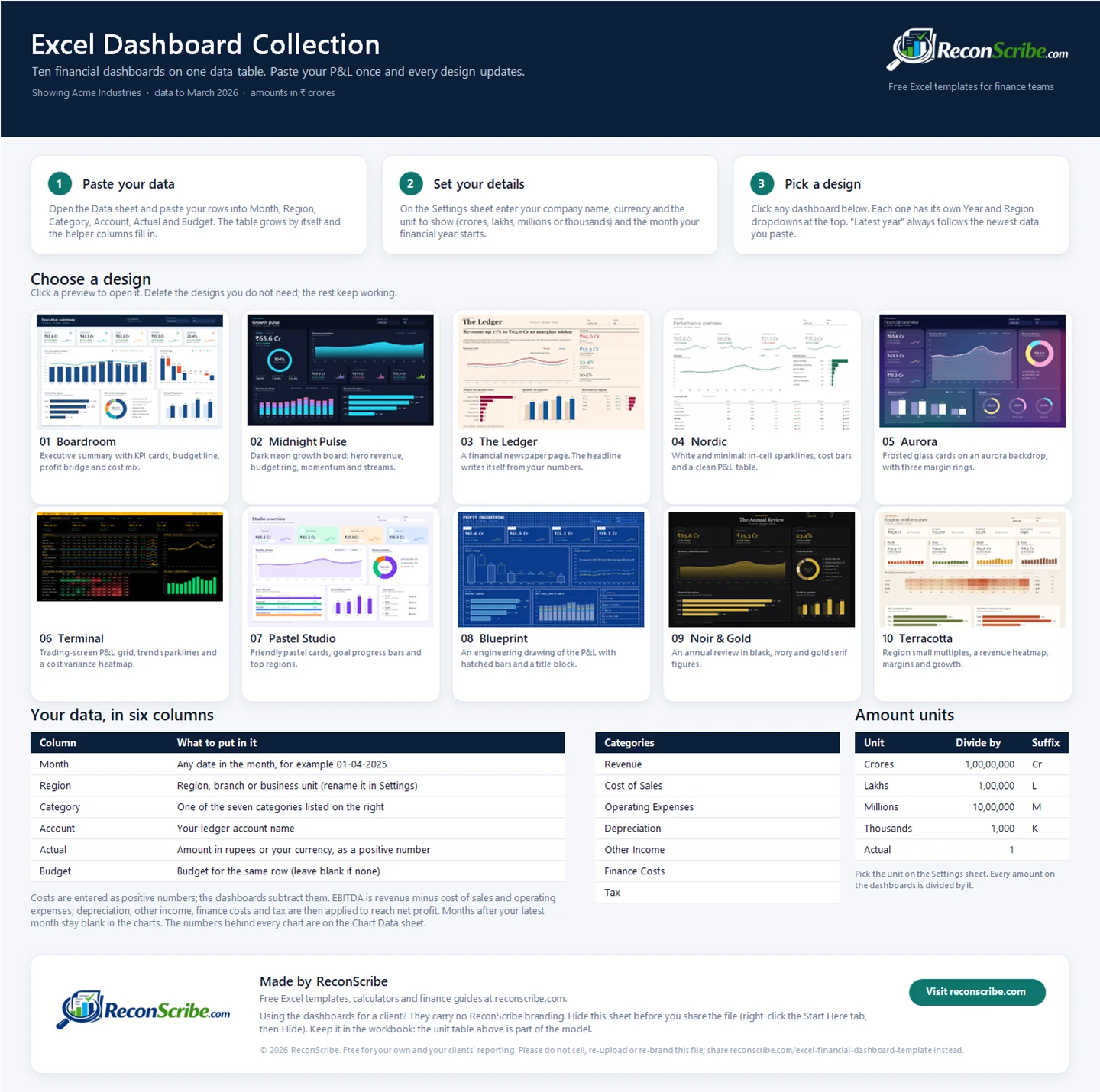
- Start Here: the set-up steps, a clickable preview of every design, the data format and the unit table the dashboards read. Hide it before you send the file to a client, and keep it in the workbook.
- Ten dashboard sheets: each with its own Year and Region dropdowns. Latest year always follows the newest month in your data.
- Data: one Excel table, tblData, with six columns you fill: Month, Region, Category, Account, Actual and Budget. Four helper columns (MonthKey, FY, FiscalMonth and Quarter) fill themselves in.
- Settings: company name, currency symbol, units (crores, lakhs, millions, thousands or actual), the month your financial year starts and what to call the Region column.
- Chart Data: the numbers behind every chart, one labelled block per chart with named series. Click a chart and choose Select Data to see the rows it plots, or copy the pattern for charts of your own.
- Two hidden sheets: Lists and Model hold the formulas behind the dashboards. You never need to open them.
The sample company, Acme Industries, is fictional. Its two financial years of monthly data across four regions are there so you can see every Excel financial dashboard template working before you add your own numbers.
Use the Excel financial dashboard template with your own data
- Save a copy of the Excel financial dashboard template and open Start Here. Keep the original download so you can compare your results with the sample.
- Prepare your rows. Each row is one account for one month: the month, the region or branch, the category, the account name, the actual amount and the budget. Enter costs as positive numbers; the dashboards subtract them.
- Paste into the Data sheet. Paste over the sample rows in the first six columns of the table. The table grows to fit and the helper columns fill in by themselves. Delete any leftover sample rows below your data.
- Set your details. On Settings, enter your company name, currency and units, and the month your financial year starts (4 for April, 1 for January).
- Open a design. Choose Latest year or another year, and All or one region, from the dropdowns at the top. Check the totals against your trial balance or P&L report before you share anything.
| Column | What to enter | Example |
|---|---|---|
| Month | Any date in the month | 01-04-2025 |
| Region | Region, branch or business unit | North |
| Category | One of the seven categories listed below | Operating Expenses |
| Account | Your ledger account name | Salaries and Wages |
| Actual | The amount for that month, costs as positive numbers | 1450000 |
| Budget | The budget for the same row, or blank | 1400000 |
The Category column must use one of seven values: Revenue, Cost of Sales, Operating Expenses, Depreciation, Other Income, Finance Costs and Tax. EBITDA is revenue minus cost of sales and operating expenses; depreciation, other income, finance costs and tax then take you to net profit.
Which Excel financial dashboard template should you use?
Every design in this Excel financial dashboard template shows the same numbers, so choose by audience and by where the dashboard will be seen.
| You need | Start with |
|---|---|
| Board or investor pack | 01 Boardroom, 09 Noir & Gold |
| Monthly management review | 04 Nordic, 06 Terminal |
| A written story for leadership | 03 The Ledger |
| A screen in the office | 02 Midnight Pulse, 05 Aurora |
| Team or client updates | 07 Pastel Studio |
| Cost and margin deep dive | 08 Blueprint, 06 Terminal |
| Branch or regional review | 10 Terracotta, 01 Boardroom |
How the Excel financial dashboard template stays live
Nothing in this Excel financial dashboard template is a picture of a chart. Every number is a formula, and every chart reads from those formulas.
- SUMIFS over one table. A hidden Model sheet totals the Data table by category, month, year and region for each dashboard, so each design can show a different year or region at the same time.
- Charts that resize. Region and account charts use named ranges that count your rows, so two branches or six regions both fill the chart without gaps.
- Chart data you can follow. Every chart reads a labelled block on the Chart Data sheet, so Select Data shows exactly what it plots and which rows to copy.
- Text that writes itself. KPI cards are text boxes linked to formula cells, and The Ledger’s headline and summary are sentences built by formulas.
- Excel features, not add-ins. Sparklines, data bars, colour-scale heatmaps and dropdown lists are standard Excel. There are no macros and no Power Query in the collection.
Recalculation is instant: in our test the whole workbook recalculated in about a third of a second on a Windows laptop.
Build your own Excel financial dashboard template: the Power Query tutorial
The collection is ready to use. If you would rather learn how an Excel financial dashboard template like this is built from a P&L export, the video and steps below build a simpler one-page dashboard with Power Query, SUMIFS and four charts. Download the tutorial workbook to follow along with the finished file.
Download the tutorial workbook
Free account required. The workbook uses Power Query, so use desktop Excel for Windows.
Watch the full Excel build
Watch the whole thing built, click by click
The same eleven steps you see below, recorded in real Excel: the export, the table, Power Query, the unpivot, the summary sheet and every chart.
Why unpivot the P&L export?
A report with accounts down the rows and months across the columns is useful for reading and can be charted directly in Excel. The difficulty comes when you want one Month field for filtering, grouping or reusable summary formulas.
Unpivoting changes the structure without changing the underlying amounts. Instead of separate January and February columns, each record has a Month value and an Amount. That gives this dashboard one consistent source layout to summarise.
It is a useful preparation step, not a requirement for every Excel chart. Microsoft shows the supported row-and-column layouts in its chart data guidance.
How Power Query and the source table work
Power Query records a sequence of data-preparation steps and runs them again when you refresh. In the tutorial workbook, Financials_Flat reads the local table PLTable, keeps Ledger and Sub-ledger, unpivots the other columns into Month and Amount, then converts Amount to a number.
The query reads the P&L sheet and writes to Flat. It does not edit your source values. Because every column other than Ledger and Sub-ledger is unpivoted, remove annual-total columns and unrelated notes before refreshing. Additional identifier columns require an intentional query change.
An Excel Table gives the query a named source that can expand when records are added. A fixed range can also be used in other query designs, but this file expects PLTable. Confirm its actual boundary after replacing data. A growing source table alone does not guarantee every downstream formula, category list and chart has expanded.
For the underlying operation, see Microsoft’s Unpivot columns documentation.
Build tutorial: eleven steps in Excel
These screenshots show the build workflow for the tutorial workbook. You do not need them to use the ten-design collection, which has its own quick start above.


How the calculations and charts connect
In the tutorial workbook, Calc uses SUMIFS to total amounts for each ledger category and month. Gross profit is revenue less cost of sales. Operating profit subtracts operating expenses, and the sample’s net-profit column then subtracts finance costs.
The dashboard cards link to totals of the monthly calculations. Net margin is total sample net profit divided by total revenue, not an average of the monthly margins. You can inspect a formula in Excel’s formula bar or use the fx dialog to review its arguments.
The revenue and net-profit chart uses two axes so both series remain visible at different scales. Read the axis labels carefully: equal visual heights on different axes do not represent equal amounts. Separate charts are an alternative if you prefer a single scale for each metric.
The bar charts use the sub-ledger lists on Calc. The sample lists are arranged largest first, but that order is not an automatic ranking rule. Recheck the names, totals and ordering when using your own data.
Adding months to the tutorial workbook
Verified behaviour: in our Windows Excel test, changing an existing input updated the dashboard after refresh. Adding a thirteenth month expanded the query output, but the monthly charts and KPI totals remained tied to the original twelve-month summary.
- Source: include new records or month columns inside PLTable. Keep unique, consistent month-and-year labels. Do not append annual totals as if they were another month.
- Query output: refresh and check that Flat contains every expected record. The sample starts at row 2 and ends at row 157. Excel extended the dependent SUMIFS ranges during our test, but inspect the resulting references after your own changes rather than assuming the last row is included.
- Monthly summary: add the new month to Calc’s Month column and extend the formulas in B:H. For a replacement year, update all twelve month labels to match the new source headers.
- Dashboard: extend the KPI sum ranges and monthly chart categories and series. The original monthly chart categories are Calc!A4:A15. Update the hardcoded FY2026 and twelve-month captions to describe the period actually shown.
- Account mix: extend or replace the revenue and operating-expense sub-ledger lists, formulas and corresponding chart ranges. Changing a top-level ledger name alone does not update those lists.
- Final check: reconcile the new period and full reporting-period totals to the source. Check that the final month is visibly plotted and that every category you intend to show is included.
Need a custom dashboard?
Want an Excel financial dashboard template in your brand colours, with extra views or built around your own chart of accounts? Email contact@reconscribe.com. Tell us your Excel version, reporting period and the changes you need. Start with an anonymised layout or sample, not confidential financial records. We will review the request and discuss scope and any pricing before work begins.
Other free Excel tools for finance teams
- Prepaid expense schedule template for amortisation and journal preparation.
- Accounts payable template for ageing and vendor summaries.
- GSTR-2B reconciliation Excel template for matching purchase invoices with GSTR-2B.
- Cash flow decision tool for a six-week cash forecast in Excel.
- Excel formulas for finance, including the SUMIFS pattern these dashboards use.
- Browse all free calculators and Excel tools.
Frequently asked questions
Is the Excel financial dashboard template free?
Yes. Create a free ReconScribe account to download the Excel financial dashboard template. The ten-design collection and the tutorial workbook are both free, with no payment or trial period, for your own reporting and for client work.
Which version of Excel do I need?
We built and tested the collection in Excel for Microsoft 365 on Windows. It uses standard Excel features such as tables, sparklines, data bars and dropdown lists, and it contains no macros and no Power Query. We have not tested it on a Mac; Segoe UI and Consolas, the fonts some designs use, are Windows fonts, so Excel for Mac shows similar substitutes.
How do I add my own numbers?
Paste your rows into the six input columns of the Data sheet: Month, Region, Category, Account, Actual and Budget. The table grows by itself, the helper columns fill in and all ten dashboards update.
Do my account and region names have to match the sample?
No. Account and region names come from your data. Only the Category column has to use one of the seven categories: Revenue, Cost of Sales, Operating Expenses, Depreciation, Other Income, Finance Costs or Tax.
Can I keep just one dashboard?
Yes. Delete the dashboard sheets you do not need and the others keep working, because each design has its own calculations. We tested this by deleting four designs from the workbook.
How do I see or change what a chart shows?
Click the chart, then Chart Design and Select Data. Every series in the Excel financial dashboard template has a plain name and points to a labelled block on the Chart Data sheet, so you can see exactly which numbers it plots. To build your own chart the same way, select a block’s label row and the rows under it, then Insert and Chart. Region and account charts resize to your data, so their series use named ranges you can open in Formulas and Name Manager.
Can I use the dashboards for client work?
Yes. The dashboard sheets in this Excel financial dashboard template carry no ReconScribe branding, so you can present them or send the file to a client. Hide the Start Here sheet first (right-click its tab, then Hide). Keep it in the workbook: the unit table on it is part of the model, and deleting the sheet stops the dashboards working.
Can I share the template with others?
Share the link to this page, so everyone gets the latest version of the Excel financial dashboard template and the set-up guide. Please do not sell, re-upload or re-brand the file.
What if my financial year starts in January or I report in dollars?
Set the starting month, currency symbol and units on the Settings sheet. Year labels, month order, unit labels and every amount on the dashboards follow those settings.
What happens if my data covers only part of a year?
Months after your latest month stay blank in the charts, and the KPI cards compare the year to date with the budget and last year for the same months. If there is no budget or no earlier year, the cards say so instead of comparing against zero.
How many regions and accounts can it show?
The Region dropdown lists every region in your data. Account charts show your six largest accounts and group the rest as All other, and region charts show your six largest regions.
Does it work in Google Sheets or LibreOffice?
Use desktop Excel. Other spreadsheet apps can open the data and many of the formulas, but the linked text boxes, card shapes and several chart styles do not carry over.
Are there any macros or security prompts?
There are no VBA macros. Excel may open a downloaded file in Protected View; choose Enable Editing once you trust the source, and do not turn off Excel’s security settings.
Does the Excel financial dashboard template calculate GST or income tax?
No. The tax line on the dashboards is whatever you enter under the Tax category. The workbook does not work out GST, income tax or any other tax.